(A contribution to the Production Design Blog-a-thon at the Too Many Projects Film Club. I had hoped to do more, but … time, work, and baby.)
 When you think of David Cronenberg, you’re likely to see fusion: Brundlefly, a living typewriter, a gun made of bones.
All of those are the work of Carol Spier, Cronenberg’s art director (from Fast Company through Videodrome) and production designer (from The Dead Zone forward, with the exception of Spider). She has also done the design for everything from Joe’s Apartment to Silent Hill to The League of Extraordinary Gentlemen.
It’s easy to reduce Cronenberg to those signature images, which clearly reflect his longstanding concern with the relationship between technology and the flesh. Yet his two most recent movies – A History of Violence and Eastern Promises – have revealed a filmmaker of startling economy and density who doesn’t need to lean so heavily on those old tricks.
Cronenberg’s and Spier’s aggressive use of the tangibly repulsive – their creations have a physicality that’s unparalleled in cinema – obscure their more-mundane (but no less impressive) storytelling skills.
As an experiment, I captured images from five Cronenberg/Spier collaborations in my DVD collection, purposefully avoiding the iconic. I began at the 50-minute mark of each movie and selected some interior shot (within a few minutes of that arbitrary starting point) that intrigued me.
I’ll largely let the results speak for themselves.
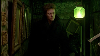
The Dead Zone (1983). This hallway, from the wallpaper to the picture frames to the lighting to the closeness, has a gothic quality that reflects the mind of one of the villains as well as the danger that faces Christopher Walken’s protagonist:
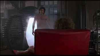
The Fly (1986). I love that the chair is the visual focal point when it’s the only ordinary thing going on here:
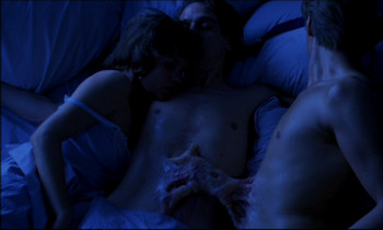
Dead Ringers (1988). This dream sequence distills the movie beautifully, and the lighting and hue help to both underplay and draw attention to the special effect:
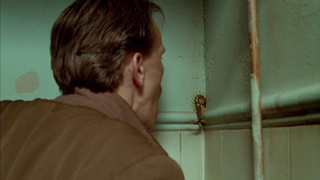
Naked Lunch (1991). The age and wear detail on the walls feels both realistic and dreamlike:
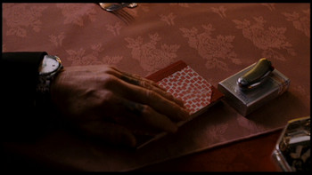
Eastern Promises (2007). Props, costume, color, and cloth impart a great deal of information:


Thanks for your participation in the Blog-A-Thon, Jeff, and a fine choice of designer to appreciate. In fact, if it hadn’t been for Carol Spier, this blog-a-thon would not even have happened. At the bottom of my write-up on Naked Lunch I have seven more screen-caps highlighting her eclectic set design (on that particular film). That was what got me started thinking about production design more particularly, which snowballed into this Blog-A-Thon.